Wednesday 15 December 2010


These are the draft posters for the Action-Thriller project.

The first draft (far left), is both a teaser and a promo as it gives all necessary information to the viewer (title, tagline etc.) except the full cast list and crew. It includes the lone image of the gun on the table with unused bullets, leaving the question as to what the film is about still open, hence the nature of a teaser trailer.

The second draft is the same as tthehe previous, a hybrid of teaser and promo. It includes all necessary information except a full cast list, but still informs the viewer of the nature of the film.

The third draft is purely a teaser trailer, as it doesn't include mush information except a cast list and title. It involves a bleeding hand on the floor next to the gun and leaves the question open as to who's hand it is and why it is there. The only clue is the title Roulette, which leads the viewer to believe that it is centered on a game of chance.

Friday 10 December 2010

Poster Example - Phone Booth


PEOPLE

The poster includes a fairly well-known actor - Colin Farrell. The poster also includes the three other main characters - the main character's girlfriend, his wife and the cop that helps him - but emphasizes mainly on the victim in the Phone Booth. This makes the viewer feel that the victim is the only character that is important, which is true as the film is only seen through his perspective - trapped in the claustrophobic phone booth.

DESIGN

The design of this poster is fairly intricate, with the victim in the phone booth, obviously panicking and distressed with the text placed to fit the booth. In the phone booth, there is a bullet hole, which could suggest the hostage situation to the viewer before he/she has seen the film. In the reflection of the phone booth, the other characters can also be seen.

COLOR

The color of the poster is very pale. There is little color variation except for the skin tone of the victim in the booth. The only other variation is the text "your life is on the line" which is written in Red.

TITLE

The title is very clearly written in a slightly "razor-sharp" font. It is also written to match up in a parallel with the side of the phone booth.

OTHER INFORMATION

The poster also includes a very clever tagline which is meant to draw a double meaning between the victim's situation an the irony of the phone booth - "your life is on the line".

Poster Example - The Deer Hunter


PEOPLE

This poster includes an instantly recognisable actor - Robert De Niro. He is displayed as the only character on the poster. This could be a conveying the sense that he is the only important character in the film.

DESIGN

The design of the poster is fairly dark, but at the same time mysterious. If the viewer had never seen the film before and did know about the infamous "Russian Roulette" scene implied in the poster's image, they would probably not know why the character is holding the gun to his head. In my mind, this creates a sense of anticipation and excitement, that the viewer does not know when this scene will come at the time of the film's release.

COLOR

The poster is mostly black. However, the text and the image of Robert De Niro stand out in white. His headband stands out in Red. In my opinion, the basic colors convey a sense that the film may be grim and dark in mood.

TITLE

The title stands out in bold with a strightforward font. The white text is easier to read against the black background. In my opinion, the straightforward but bold font conveys the fact that the film has a very straightforward storyline, but is still very powerful.

OTHER INFORMATION

The poster also includes the full cast below the title. This poster does not include a tagline.

Poster Example - Seven


PEOPLE

This poster includes the two main characters and their actors - Brad Pitt and Morgan Freeman - Clearly stated at the top of the poster.
They are presented almost as symmetrical mirror images of each other. This could be to convey the fact they that in the film these two characters are the same type of person - Cops trying to catch a killer.

DESIGN

This poster is designed to give the impression of a grim plot and setting, as the poster is very distorted. This poster remains true to the mood of the film as the film is set in a very grim place where it never stops raining.

COLOR

The color of the poster is very Sepia colored. This is designed to convey a grim mood and a sense of darkness. Even the actor's faces have been included in the Sepia tone of the poster.

TITLE

The movie's title is very clear as it stands out with a strange, chilling font and also stands out because it is the only white text in the sepia toned poster. The text is easy to read but most of the text is also sepia toned and is smaller and more straightforward than the title.

OTHER INFORMATION

The poster also includes a tagline that very much sets the scene for the film - Seven deadly sins, Seven ways to die.


Tuesday 7 December 2010

Action-Thriller storyboard


This is the establishing page for our storyboard, It includes the establishing shot of the two victims waking up in an anonymous room and the mid-shot of the villain entering.


This is the first part of the main body of the story, in which the victims start playing Russian Roulette.


This is the main body of the game of Russian Roulette, This is also the page in which one of the victims dies as a result of the game.


This is the page in which the action of the story happens and the story comes to a quick end.

Wednesday 1 December 2010

Action-Thriller Moodboard


Above is the Moodboard for my Media group's upcoming project. An end sequence from an Action-Thriller about two victims that are kidnapped by a psychopathic character and forced to play Russian Roulette much like Cold War torture. This Moodboard is intended to show some stereotypical elements from other Action-Thrillers that will be used in our project. Such as dark settings and strange images. As our project is about the theme of torture (specifically cold war russian roulette), I have chosen some images from The Deer Hunter (from which their is a very powerful scene of russian roulette torture) and Marathon Man (From which their is a scene of Nazi dental torture). I have also chosen images of dark rooms and weapons in order to emphasize on the violence of the project. The images of the The Deer Hunter and other images of hostages are intended to show the theme of victimization, as the characters in the project are also meant to victims at the hand of a psycho. You may also notice that I have included some images that emphasize the psycopathic nature of the third character in the project.

Wednesday 10 November 2010

Garageband task

As a task alongside our Bomb plot project, we were asked to compose a small soundtrack in the music program called garageband. As the subject matter of our short film was quite serious, I felt that I required quite a heavy and distorted sound. I searched the many samples of different music available in GarageBand and eventually came up with this:


This is my soundtrack. I copied this audio file from my account on divshare

Here is an image of the basic Garageband layout:

As you can see, The program is quite intricate. The right-hand side shows a range of different musical styles such as Rock/Blues, Jazz and different instruments such as Drums and Guitars. The centre shows my audio track and and the left-hand side shows the different interlacing instruments that I have put together.

Below is another image, this time of my complete audio track, just before exporting:


Monday 1 November 2010

Print - The Daily Mail


Institution

The Institution for this media example is the head office of The Daily Mail, As they are responsible for Printing, Publishing and editing the newspaper.

Purpose

The purpose of this media is to inform local people of events around their local area, other area and the world.

Distribution

I would say that the company responsible for distribution is the company Associated Newspapers ltd. as they are the publishing company

Target Audience

I would say that the target audience mainly consists of adults and some young people that are interested in world events.


Friday 29 October 2010

The Phone Call write-up


Section 1: The Task and Planning

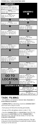
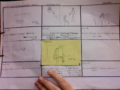
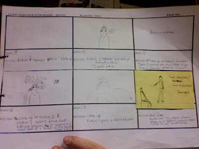
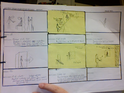
We were given the task to film and edit a piece of footage to look like a real-time phone conversation. This footage is the first of three chapters that will make a story about a supposed bomb plot in the college. In order to do this, we would have to film in two separate locations within the college and have both characters speak on the phone. Below is a shot list/plan for the phone call, that we had to stick to in order for the video to make sense:


After being talked through what shots we had to include (Establishing shots, close-ups), we set about drawing up a storyboard. The shot list was quite useful as it helped us keep track of what shots we had to do next. The Storyboard process went quite well despite a few creative differences over shot location and style. Ultimately, we decided on where to shoot the phone call and how to shoot it.

Section 2: Filming and Editing

The shooting process flowed better than it did when we shot the horror stills. For instance, we all acted more professional and each individually knew our role within the group and how to do it. We also immediately knew what to shoot next thanks to the shot list. My main individual contribution to the project was that of playing one of the characters and partly behind camera direction of the project.

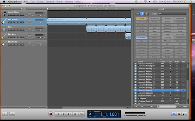
The editing process also went without a hitch. It was just a matter of trimming the clapperboards at the beginning of each clip and lining up the footage perfectly in a way that made it look like a real-time conversation. Below is a “before shot” of the final cut timeline before the clapperboards are trimmed off:


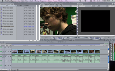
The Clapperboards certainly helped us Final Cut by showing us which shot was which.

At the climax of the editing process, what we had was essentially a “rough cut”, which means a cut of the footage that is not yet complete, in a sense that it is missing a title card and a soundtrack and maybe some other effects that may be added later after approval.

At the end of the footage is a shot of Character 2’s hand opening the door to G19, in Chapter 2: The Meeting, we will need to follow this on with a “match-on action” shot, which is when the cameraman lines up the characters in the same way that they were before the shot cut and follows it up as realistically as they can in the next shot.

With this project, we have certainly learned a lot about Final Cut. For Example, One problem that I had is that Craig’s voice is slightly low on camera. In response to this, we multiplied his voice signal to make it more clear. It made me realise that a majority of the problems that are face by amateur filmmakers can be solved in editing.

Wednesday 20 October 2010

Match-on action

Match-on action is a technique of filming where a shot is taken and then followed on in the next shot as realistically as possible. For instance, filming a person opening a door and then following on with them entering the room that the door leads to.

The 180 degree rule


The 180 degree angle is an imaginary line that cuts through the scene. If crossed, the scene may swap over and cause confusion for the viewer. For this reason, crossing the line is usually avoided.


Tuesday 19 October 2010


This is an image of my timeline before editing, including clapper boards


Tuesday 12 October 2010

Snatch - Stereotypical Target Audience Member


This is my interpretation of a member of the target audience for the 2000 crime film Snatch.

As you can see, a person interested in the film Snatch would most likely be interested in other crime films like Lock, Stock and Two Smoking Barrels and The Italian Job. They would also most likely be into British Rock n Roll and other heavy rock music such as The Rolling Stones, The Who and The Sex Pistols. As far as TV goes, the target audience member may be interested in British TV shows such as The Inbetweeners and This is England '86. The target audience member may also like gaming. If they are into gaming, My mind tells me that they would be interested in heavy, violent games such as Modern Warfare and the Halo series as Snatch is a fairly violent film. As for brands, the target audience member may be interested in a mainstream popular alcohol such as Fosters beer. In terms of clothes, the audience member may wear simple generic clothes such as a white t-shirt and jeans.

Thursday 7 October 2010

Find Your Tribe - Result


I visited a website called find your tribe y result was in order to find out what type of person i am. My result was Indie Kid. I agree with this, as I love to be independent and free from control. I also have a passion for rock 'n roll and alternative indie music. I also love independent filmmaking.

Tribe description

You are an Indie Kid! There’s nothing like the twang of a guitar to get your Converse tapping. Indie Kids are part of a mass – whether that means swaying with their friends at a gig, commenting on Drowned in Sound’s message board or trawling through band profiles on MySpace for the next exciting sound. It’s amazing what can still be done with a guitar, you know.


Sunday 26 September 2010

Logo Report

Photoshop

I would say that coming up with an idea for a logo and putting it onto paper. At first I tried thinking of simple ideas like "Stickman films" as a working title. I then tried to think of a more imaginative title and logo but a logo that was still "do-able" in photoshop. I then reverted to a subject that I am passionate about, music. I created a simple logo - a spyrograph type shape that resembled the sun - and coloured it in yellow. I then wrote the title, Psychadelic Entertainment freehand and in different colours to give the impression of a psychadelic experience and irregularity.

Final Cut

I would say that the most difficult part about Final Cut was choosing a way to introduce the logo and title with a suitable sound and visual effect. I overcame the visual problem by having the sunshine image and title fade in. However, I may change this at a later time. I have not yet overcome the sound effect problem. I would like to find a suitable sound effect for the psychadelic image,

Conclusion

Overall, I would say that I am most pleased with the fact that although my logo didnt take long to make and used few photoshop effects, it has a very peaceful effect on the viewer and gives an impression of imagination and possibility in the films it represents, mush like psychadelic music.

Wednesday 22 September 2010

Electronic Media - Halo Reach Invasion Gameplay

Institutions

The institution responisble for containing this product is youtube.

Purpose

The purpose of this product is to inform people of the graphics and multiplayer experience involved in the game.

Distribution

The company responsible for distributiong this footage is Microsoft game studios

Audience

The intended audience for this product is young people and fans of the game


Advertising - Halo Reach trailer

Institutions

The institution responisble for containing this product is Youtube.

Purpose

The purpose of this product is to advertise and inform people about the upcoming game.

Distribution

The company responisble for distributing this product is Microsoft game studios

Audience

The audience for this project is mainly young people, gamers and people who are anticipating the game.


Audio/Visual - The A Team trailer

Institution

The institution responsible for containing this product is the youtube website

Purpose


The purpose for this video is to inform people about the upcoming film

Distribution

The company responisble for distributing this product is 20th century fox.

Audience

The intended audience for this product is mainly young people and popeople who have been anticipating the film.


Audio - AC/DC "If you want blood"

Institution

Youtube is responsible for the institution of this product, as it has contained the product ready for people to see

Purpose

The purpose for this products to entertain fans of the band.

Distribution

Atlantic Records were responsible for the distribution of this song as they are the label that manages ACDC

Audience

This product is mainly aimed at music fans, both young people and adults.